


Vanavond ontving ik van de curator van de The First Berliner Art Book 2022 de zogenaamde printproof van de foto’s zoals die er in het Art Book uit komen te zien. En dat leverde een leuke verrassing op!
In november waren er, in plaats van zes foto’s waarom gevraagd was voor de publicatie, in totaal twaalf foto’s ingestuurd, met de mededeling aan de curator van The First Berliner Art Book 2022 om daaruit zes foto’s te halen, waarbij van elk model tenminste één foto wordt gepubliceerd.
De curator stond daar welwillend tegenover maar gaf ook aan dat het niet zo’n gemakkelijke taak zou worden.
Nu met de printproof in handen, blijkt dat inderdaad ook lastige klus geweest te zijn, want, verrassing… het aantal foto’s is terug gebracht tot negen.
Het betekent dat er drie foto’s meer worden getoond dan het maximaal aantal van zes die voor de publicatie vereist is.
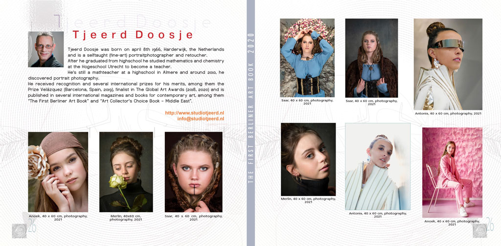
De foto’s die in het Art Book zullen worden afgedrukt staan hier onder (op alfabetische volgorde van voornaam model).
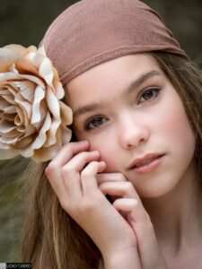
Anoek (0236)


Aan de lay-out kan en mag naar mijn idee nog wel wat gewijzigd worden; dat is ook precies waar een printproof voor bedoeld is.
Sommige foto’s komen minder goed tot hun recht op bepaalde plaatsen op de bladzijden.
De layout zoals ik die kreeg toegestuurd:
Aan de curator heb ik de volgende e-mail gestuurd, vergezeld met een layout zoals ik die voor ogen heb:
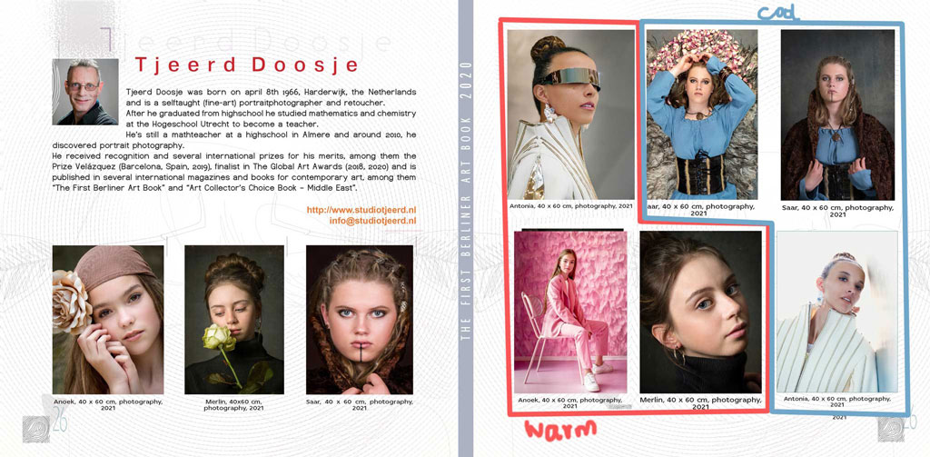
“Beside what you mentioned about the layout and the text beneath it, I’ve some remarks that may help you.
First of all: the title (the double page jpg) now says: “The First Berliner Artbook 2020”. I guess this should be: “The First Berliner Artbook 2022”?
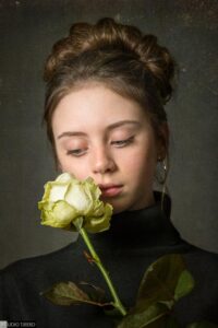
Second: you may name Merlin as “Merlin Sen” and Antonia as “Antonia Leite”.
I have a question about the difference in height of the photos. For example: on the second page, the first photo of Antonia is bigger than the other photos of Saar in the first row on the second page. Is there a special reason for? Or did I not deliver the photos in the same height and width? The same goes for the last row of photos on the second page.
I noticed that the photo of Antonia (leaning to the wall) has a blue border around the photo. It’s the only photo that has a border as far as I can see. Is this intentional or is this by accident?
On the first page, all photos have a tiny vertical line to the upperright of the photo, while the other photos on the second page don’t have these. Again: is this intentional or is this by accident?
Suggestions I’d like to make about the arranging of photos are these. I attach my suggestions/ideas in the attachment.
On the first row of the second page, my suggestion would be to have the photo of Antonia in the lefthand top corner (first photo on the row). Now Antonia is looking into the book instead of looking outside the book (if you know what I mean).
On the second row of the second page, my suggestion would be to have the photo of Anoek as the first one, the photo of Merlin as the second/middle one and the photo of Antonia on the third place in the row. Also for the reason I mentioned above, but now for the photo of Anoek. The photo of Antonia now literally is the closing photo because Antonia is leaning against the wall (which makes the wall a kind of keystone).
I like the colorpalette in the second row of the second page very much.
The other thoughts I had about arranging the photos in this way are:
– repetition: the model of the first photo on page one is the same as the first photo on row two of the second page
the model of the second photo on page one is the same as the second photo on row two of the second page
the model of the first photo on the second page (row 1) is the same as the last photo on row two of the second page (diagonal)
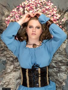
– tones: on the second page in “L-shape”, the photos are more of a warmer tone; in the mirrored “L-shape” the photos are more of a cooler tone, while the photo of Saar (first row, second photo) acts like a connection/transition between the warm and the cool photos.
The diagonal left bottom to right top now also have a nice colorcontrast (warm-cold).”
It’s just a thought of how the photos could be re-arranged but I don’t know whether that suits your thought about the layout and also I don’t know whether this might be breaking the layout of the other pages of other artists.
So please do see this as a suggestion.
Ik ben benieuwd hoe er op die aanpassing in de lay-out zal worden gereageerd.
The First Berliner Art Book is een publicatie in eigen beheer van Art Management Berlin (AMB). Het boek wordt in een relatief kleine oplage (1.500 exemplaren) gedrukt en wordt ter promotie gebruikt voor de kunstenaars die in het Art Book zijn opgenomen door zowel de kunstenaars zelf als door AMB.
Eerdere berichten over “The First Berliner Art Book 2018-2022”:
Inzending ontvangen
Benodigdheden opgestuurd
Insturen foto’s mag wat later
Uitstel gevraagd voor insturen foto’s
Verzoek om zes foto’s
Betaling gedaan
Uitnodiging voor 2022 editie
Art Book is afgeleverd
Update
Drukproef ontvangen
Publicatie is rond
Benodigdheden opgestuurd
Betaling gedaan
Publicatie kan doorgaan
Publicatie wellicht mogelijk
Uitnodiging voor 2021 editie
Saar blij met publicatie
Kunstboek is afgeleverd
Drukproef ontvangen
Publicatie een feit
Benodigdheden opgestuurd
Vandaag lancering First Berliner Art Book 2019
Betaling gedaan
Art Book is opgestuurd
Uitnodiging voor officiële lancering
Drukproef ontvangen
Benodigdheden opgestuurd
Herinnering
Publicatie 2019 een feit
Betaling gedaan
First Berliner Art Book 2018 in handen
Art book is opgestuurd
Namenlijst bekendgemaakt
Drukproef ontvangen
Publicatie een feit
Geselecteerd